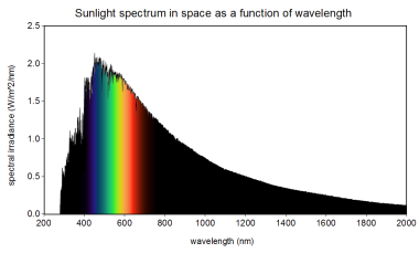
You are only browsing one thread in the discussion! All comments are available on the post page.

Return

Limonene ,

There are 2 reasons:

  1. Those two graphs have different scales on the y-axis. One is Irradiance per nanometer of wavelength, and one is Irradiance per terahertz of frequency. Both graph’s y-axis are called “spectral irradiance”, despite being different things. This causes most of the distortion between the two graphs, and can even change the location of the absolute maximum.
  2. The graphs’ x-axis have different units. This causes some distortion too, but wouldn’t change the absolute maximum. It would help if they used a log scale in both cases, because wavelength and frequency are inversely related, so then the graphs could just be horizontally flipped.

So, look at the top graph (by wavelength), and see how much power is in that 1000-2000nm area. It’s still a lot, just spread out over a large area. It’s the same amount of power in the lower graph (by frequency) shoved into the much smaller area from 150THz to 300THz. Since it’s in a smaller area on the lower graph, it has more power-per-unit-of-x-axis.

BackOnMyBS OP ,
@BackOnMyBS@lemmy.world avatar

Thank you. I understand most of your comment, and it makes sense. However, I still don’t understand how the change of units in the y-axis would cause a different maximum. It seems to me that the y-axis for both use the same formula with their respective x-axes: W/m^2/x.

I’m not in STEM by the way.

Limonene ,

It’s because the wavelength and frequency are inversely related. When the wavelength is low and the frequency is high, the wavelength is also moving very slowly, compared to the frequency which is moving very quickly. Since the frequency is changing so quickly, the power-per-unit-frequency is lower at higher frequencies, and higher at lower frequencies (at least relative to the power-per-unit-wavelength).

Let me try and use a car analogy:

You’re driving home through Wisconsin, and you live on the border between Wisconsin and Minnesota. The mile markers on the road decrease as you go, reaching 0 at the state border, where you happen to live.

The cows along the highway are evenly distributed, so if you count the cows as you drive, but restart your count every mile when you see the mile marker, you will reach the same number of cows every mile.

Now, the frequency is inversely related to the mile number. The frequency in this case refers to your children in the back seat asking, “Are we there yet?” They know damn well how far it is to home, because they can just look at the mile markers. Regardless, their rate of asking increases as the mile markers go down. When you’re at mile marker 100, they ask once every 10 minutes. When you’re at mile marker 1, they ask 10 times per minute.

If you instead look at the number of cows between “Are we there yet?” asks, then you will find that the cows-per-ask is much different from the cows-per-mile. At high distances (low frequencies), the cows-per-ask is very high, while at low distances (high frequencies), the cows-per-ask is very low.

Now, the article is looking at power-per-unit-frequency, so you’d actually have to measure the rate in change of how often the kids ask “Are we there yet?” And that would give you a little different result. You might need calculus to correctly calculate the derivative of the number of asks. But hopefully this illustrates that you can get different results, by using a different per-thing to measure your value.

Kethal ,

This covers it all well, but I think a simple explanation is that although “W/m^2/x” looks the same on the axes, it’s not the same. f=1/w, so one axis is W/m^2/f and one is W/m^2*f. The article makes a big deal out of the differences as if the x axis were the only difference, but they’re just very different things being plotted.

  • All
  • Subscribed
  • Moderated
  • Favorites
  • random
  • [email protected]
  • All magazines