You are only browsing one thread in the discussion! All comments are available on the post page.
Return
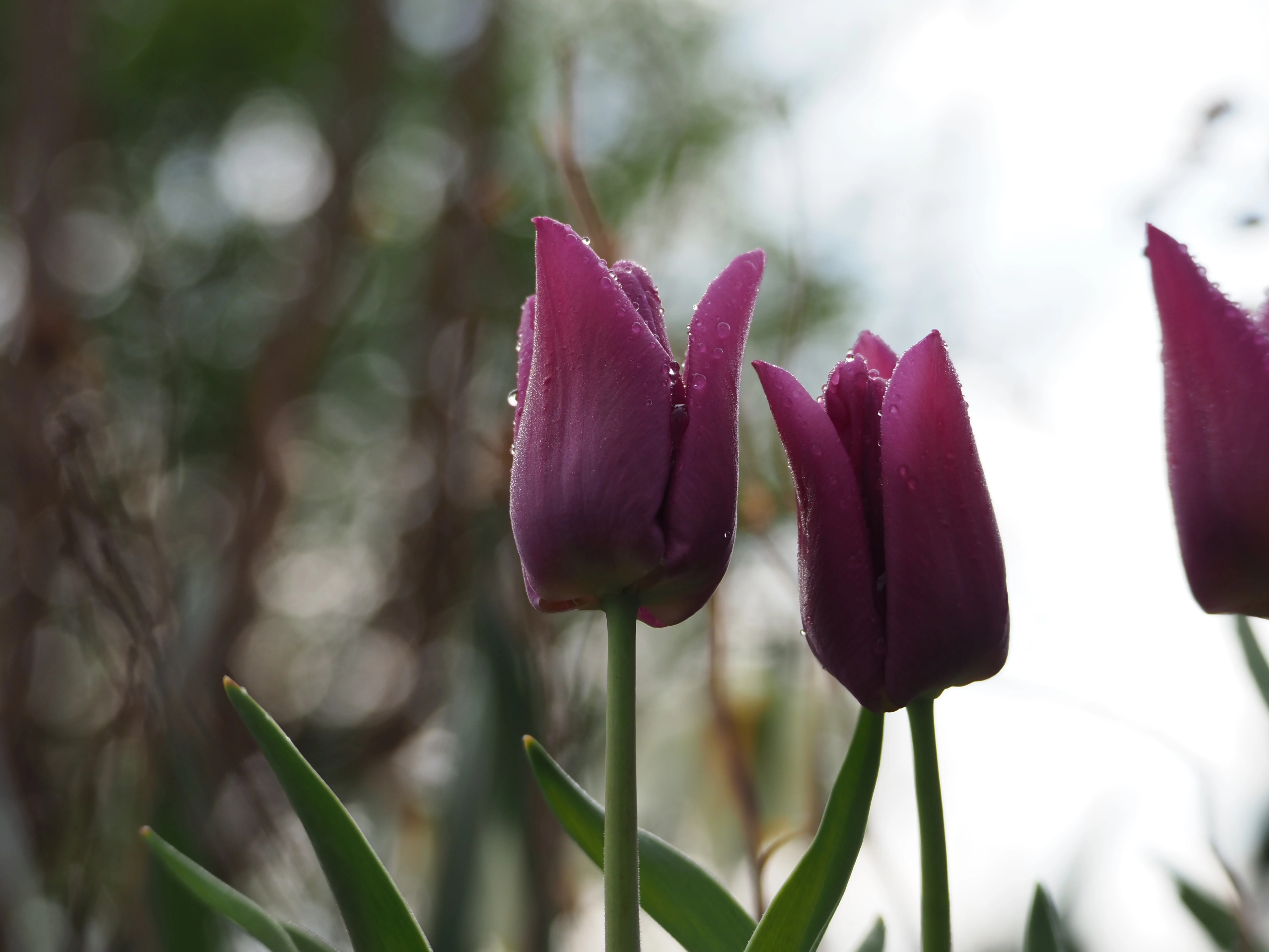
Thavron , 2 months ago There's more that more experienced photographers can put more eloquently, but as a graphic designer I have two immediate points of feedback: Editing wise I would up the saturation a bit, and a bit more contrast in the lighting. The framing could be better: the part of the flower seen on the right adds nothing to the composition and distracts. Cropping it off would be better.
There's more that more experienced photographers can put more eloquently, but as a graphic designer I have two immediate points of feedback:
stargazingpenguin OP , 2 months ago Thanks for the input! I had crossposted it to the .world instance as well, and someone there had suggested a tight crop like this which I really liked. https://lemmy.zip/pictrs/image/3c149bf6-94aa-4140-974f-2294423f8745.webp I will definitely try what you suggested! Editing is something that I would like to dig into more.
Thanks for the input! I had crossposted it to the .world instance as well, and someone there had suggested a tight crop like this which I really liked.
https://lemmy.zip/pictrs/image/3c149bf6-94aa-4140-974f-2294423f8745.webp
I will definitely try what you suggested! Editing is something that I would like to dig into more.
Churbleyimyam , 2 months ago It looks great like this
It looks great like this