You are only browsing one thread in the discussion! All comments are available on the post page.

Return

uriel238 ,
@uriel238@lemmy.blahaj.zone avatar

Omitted is the capital Q that looks like a 2.

TimewornTraveler ,

the bane of Ramona Quimby

root_beer ,

Teacher took that poor cat’s head right off

Rez ,
@Rez@sh.itjust.works avatar

It’s there, almost all the way to the right, about 1/3 from the top.

HopingForBetter ,

That’s a different Q.

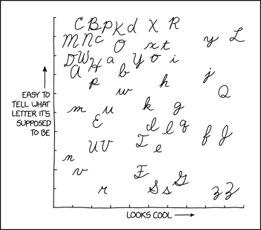
This Q really looks nearly identical to a 2. So, for many of us in 3rd grade, we wrote about the 2ueen who 2uestioned why ducks say 2uack. It was 2uite difficult.

uriel238 ,
@uriel238@lemmy.blahaj.zone avatar
Faresh ,

Isn’t it Tammy?

uriel238 ,
@uriel238@lemmy.blahaj.zone avatar

That’s a very J-shaped T.

PunnyName ,

Yep! Now look for the capital J in the xkcd image, hehe.

aulin ,

There isn’t one, is there?

PunnyName ,

There is, actually: far right, about 1/3 the way up, below the obvious Q.

aulin ,

I thought that was a lowercase f. Doesn’t look anything like the cursive J we learned as kids.

PunnyName ,

It’s the one next to the lowercase f, to the right of it

Jorgelino ,

Lowercase f is to the left of it for extra confusion.

psud ,

My mum’s name started with J, so I have seen that style of J often

Faresh ,

I don’t think I’ve ever seen someone write a J with the top extending beyond the root. The inward curvature of the foot I think is because it loops around and connects with the «a» afterwards (that connection is either very faint or not visible in the picture)

megane_kun ,
@megane_kun@lemm.ee avatar

IIRC, cursive capital Q is supposed to start way down, so that it’d look like an O with a broken infinity symbol in its butt, like this:

https://i.imgur.com/xenh0Fc.jpg

The direction of the strokes in the image is not how I learned it, though. Stroke 1 for the capital starts where stroke 2 starts, but going clockwise until just past where it starts, then smoothly start the second stroke (same direction as shown in the image).

However, I can see how it can look like a more flowy 2 and how people can say “yeah, that’s a capital Q.” Heck, cursive lowercase r barely looks like an r but people kinda get it.

uriel238 ,
@uriel238@lemmy.blahaj.zone avatar

Perhaps in your school. When I was in grade school learning cursive, the Q started high and looked like a 2.

I’m actually glad if they changed it.

These days, I avoid writing, but can do cursive, and will aim more for recognizable upper-case letters than standards.

megane_kun ,
@megane_kun@lemm.ee avatar

Oh, yeah! It can vary from place to place and even from school to school even in the same place! There were even people saying that they can guess from which school someone graduated from based on how they do cursive. I think that’s just nuts.

My cursive nowadays is just reserved for when I‌ really need to write fast, and would tend towards some kind of a personal shorthand than any sort of legibility. 😅

FlyingSquid ,
@FlyingSquid@lemmy.world avatar

Not only did it look like a 2 when I learned it, there was a Ramona book where she liked the cursive Q because it looked like a 2.

captain_aggravated ,
@captain_aggravated@sh.itjust.works avatar

Go ahead and tell me that whole thing wasn’t a direct result of early 20th century lead emissions.

  • All
  • Subscribed
  • Moderated
  • Favorites
  • random
  • [email protected]
  • All magazines